UX/UI Tasarım
Skinpuff
To launch the Skin Puff brand into the highly competitive skincare market, specifically targeting and capturing the attention of a Gen Z and younger demographic. To transform sunscreen from a "boring necessity" into a "desirable" and aesthetic part of a daily routine. The goal was to create a brand perception that was simultaneously trustworthy and "cool," using a completely digital-native language.
Projeyi görüntüle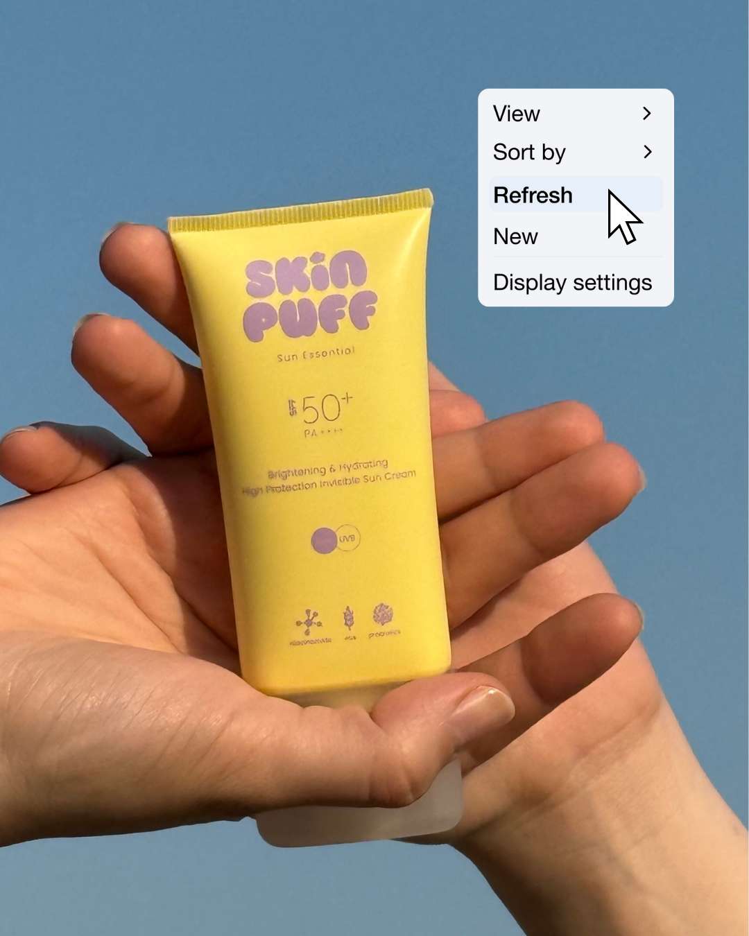
The Challenge
The Strategy & Concept
To merge "Skincare" with "Lifestyle." Presenting Skin Puff not just as a product, but as an "aesthetic" and a "mood."
- Visual Identity: A visual world was created based on the brand's signature pastel yellow and lilac color palette. These colors represent youth, energy, and the "clean girl" aesthetic.
- Content Balance: The feed was designed like a "moodboard" rather than a repetitive product catalog. A perfect balance was struck between product-focused shots (texture, packaging), lifestyle shots (outfits, beach, coffee), and educational content ("Green Flags," "True/False").
- Sense of Community: Content highlighting influencer collaborations and user experiences (UGC) like "Products That Influenced Me" was used to build a community around the product and create a "FOMO" (Fear of Missing Out) effect.
- Template Design: Minimalist and engaging templates for both static posts and Reels covers were created, adhering strictly to the brand's color codes and modern typography ("35% Off," "Green Flags," etc.).
- Lifestyle Photography: To give the feeling that the product is an accessory, not just sunscreen, concepts like "fit your best" (outfit suggestions) and aesthetically rich outdoor photoshoots were planned.
- Educational Content: To deliver information in the simplest, most "Instagram-friendly" way, graphic-supported, easy-to-read micro-educational content like "True/False" or "SPF is your bff" was produced.
- Feed Curation: The grid layout was meticulously planned to look aesthetically pleasing as a whole. A harmonious rhythm was established, ensuring the colors, lifestyle photos, and graphic designs worked together cohesively.
The Designs